Informatics Practices Class 12 Notes – Plotting Data Using Matplotlib
→ Data Visualisation: It refers to the graphicalor visual representation of information and data using visual elements like charts, graphs and maps, etc. The purpose of plotting data is to visualize variation or show relationships between variables.
→ Pyplot of Matplotlib Library: The matplotlib is a Python library that provides many interfaces and functionality for 2D – graphics similar to MATLAB’s in various forms. It provides both a very quick way to visualize data from Python and publication – quality figures in many formats.
→ Pyplot: It is a collection of methods within matplotlib which allows. user to construct 2D plots easily and interactively.
![]()
→ Installing and Importing Matplotlib: It can be installed using the following pip command from the command prompt:
pip install matplotlib
→ For plotting using Matplotlib, we need to import its pyplot module using the following command:
import matplotlib.pyplot as pit
→ Plot ( ): The pyplot module of matplotlib contains a collection of functions that can be used to work on a plot. The plot() function of the pyplot module is used to create a figure.
→ Figure: A figure is the overall window where the outputs of pyplot functions are plotted. A figure contains a Notes plotting area, legend, axis labels, ticks, title, etc.
→ Chart Types: We can create different types of graphs and charts using Pyplot. Some commonly used charts types are:
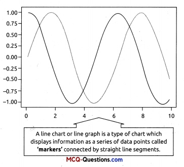
→ Line Chart: A line chart or line graph is a type of chart which displays information as a series of data points called ‘markers’ connected by straight line segments. With pyplot, a line chart is created using plot() function.
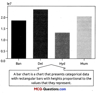
→ Bar Chart: A bar chart or bar graph is a chart or graph that presents categorical data with rectangular bars with heights or lengths proportional to the values that they represent. The bars can be plotted vertically or horizontally. With pyplot, a bar chart is created using bar( ) and barh( ) functions.
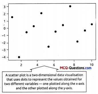
→ Scatter Plot: The scatter plot is similar to a line chart, the major difference is that while line graph connects the data points with a line, scatter chart simply plots the data points to show the trend in the data. With pyplot, a scatter chart is created using scatter( ) function.
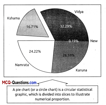
→ Pie Chart: A pie chart (or a circle chart) is a circular statistical graphic, which is divided into slices to illustrate numerical proportion. With pyplot, a pie chart is created using pie( ) function. But pie chart can plot only one data sequence unlike other chart types.
→ Histogram Plot: A histogram is a type of graph that provides a visual interpretation of numerical data by indicating the number
of data points that lie within a range of values. With pyplot, a histogram is created using hist( ) function.
![]()
→ Boxplot Chart: A boxplot is the visual representation of the statistical five number summary of a given data set. With pyplot, a boxplot is created using boxplot ( ) function.’
→ List of pyplot functions to plot different charts:
![]()
| plot (\*args[, scalex, scaley, data]) | Plot x versus y as lines and/or markers. Make a bar plot. |
| bar(x, height!, width, bottom, align, data]) | Make a bar plot. |
| boxplot(x[, notch, sym, vert, whis, …]) | Make a box and whisker plot. |
| hist(x[, bins, range, density, weights, …]) | Plot a histogram. |
| pie(x[, explode, labels, colors, autopct, …]) | Plot a pie chart. |
| scatter(x, y[, s, c, marker, cmap, norm, …]) | A scatter plot of x versus y. |
→ Marker: A marker is any symbol that represents a data value in a line chart or a scatter plot. In other words, the data points being plotted on a graph/chart are called markers.
| marker | description | marker | description |
| ‘.’ | point marker | ‘H’ | hexagon2 marker |
| ‘,’ | pixel marker | ‘1’ | Tri _down marker |
| ‘o’ | circle marker | ‘2’ | tri_up marker |
| ‘+’ | plus marker | ‘3’ | tri_ left marker |
| ‘x’ | x marker | ‘4’ | tri_right marker |
| ‘D’ | diamond marker | ‘V’ | triangle_down marke |
| ‘d’ | thin_diamond marker | ‘A’ | triangle_up marker |
| ‘s’ | pentagon marker | ‘<‘ | triangle- left marker |
| ‘P’ | star marker | ‘>’ | triangle_right marker |
| ‘h’ | hexagonl marker | ‘l’ ‘-‘ | vline, hline markers |
→ Colour: It is also possible to format the plot further by changing the colour of the plotted data. We can either use character codes or the colour names as values to the parameter colour in the plot( ).
| character | colour | character | colour |
| ‘b’ | blue | y | yellow |
| ‘g’ | green | ‘k’ | black |
| ‘r’ | red | ‘c’ | cyan |
| ‘m’ | magenta | W | white |
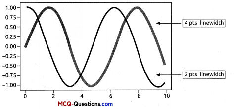
→ Linewidth and Linestyle: The linewidth and linestyle property can be used to change the width and the style of the line chart. Linewidth is specified in pixels. The default line width is 1 pixel showing a thin line. Thus, a number greater than 1 will output a thicker line depending on the value provided.
![]()
→ We can also set the linestyle of a line chart using the linestyle parameter. It can take a string such as “solid”, “dotted”, “dashed” or”dashdot”.

→ The Pandas Plot Function: The plot() method of Pandas accepts a considerable number of arguments that can be used to plot a variety of graphs. It allows customising different plot types by supplying the kind keyword arguments.
Syntax: plt.plot(kind),where kind accepts a string indicating the type of .plot
| Kind = | Plot Type | Kind = | Plot Type |
| line | Line plot (default) | box | Boxplot |
| bar | Vertical bar plot | Area | Area plot |
| barh | Horizontal bar plot | Pie | Pie plot |
| Hist | Histogram | scatter | Scatter plot |